Remember: even the ugliest of ducklings has the potential to blossom into a swan. Or, in other words: quit your bitching change-fearers.
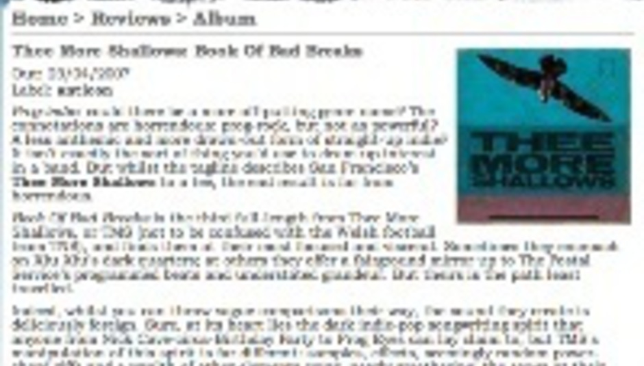
The new, improved, more-boxed DiS has been a long time coming; the old design, which can be seen pictured there for you nostalgic sorts, had outstayed its welcome rather, and you know what they say about a change being as good as a rest, right? Exactly: we’re all nicely rested now. Save for all the sleepless nights and meetings… and meetings… and meetings. Anyway, the new DiS…
Features! We’ve some new ones, the most obvious being the option to vote for articles and threads. This allows users to rank their favourite content, and the more votes an article or thread receives the higher it will rank when viewed according to ‘most voted’ on the site-flanking columns. See the question mark beside each voting button? Click it for a full explanation.
Scroll right to the bottom of the page – any page – and you’ll find a randomly plucked from the past article for your reading pleasure (or not – depends what it is!). This ‘from the archive’ feature will enable you to dip in and out of our extensive history. And boy oh boy do we have a lot of stuff there for you to stumble across.
You’re probably wondering what that ‘Drownloads’ link is, too. Currently, that’s for us to know and you to find out, but it’s exciting, that’s fo’sho.
Yes, we know there are a few bits that don’t quite work properly yet, and that the new design isn’t to everybody’s taste. But, the bugs will be flattened and time’s a healer. Besides, we really like the new design, and the flexibility of the newly formatted front page will enable DiS to feature a much broader array of content.
If you’re really struggling to come to grips with the new-look DiS, bear in mind the words of board monitor fishplums:
Essentially, the DiS users have looked at their toilets after sitting down for a poo and gathered round to scream "OMFG, HOW UGLY IS THAT?? OMG I WANT MY TOILET HOW IT WAS BEFORE".
The toilet will be flushed in due time.

