So, we've seen when artwork goes well here, when there's a synthesis between the music, image of the group and the packaging. But sometimes, just sometimes, it doesn't work. Be it laziness, complacency, a desire to use computers without the knowledge, a failure to turn a vision into something coherent, or a lack of artistic talent, artwork can be pretty shocking, undermining the music you're trying to sell. Just look at poor old Hard Fi. Barely been seen since that disastrous artwork (more on that below). So, here are some of my favourite best worst album covers. We raise our glasses to your brilliance.
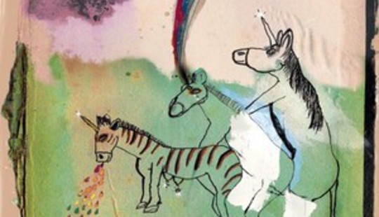
CocoRosie - Noah's Ark
A unicorn threesome (with one vomiting rainbows) drawn by a four-year-old. It couldn't go wrong, could it?

MIA - _/\/\/\Y/_
"It's like how the CIA owns Facebook, and the Government run the internet, and, like, they're all sort off filming us ALL THE TIME, so we're always on YouTube, 24/7, and so I'm imprisoned by status bars, but I'm winning, cos my name is spelt in gold bullion and stuff?" (File under: mess)
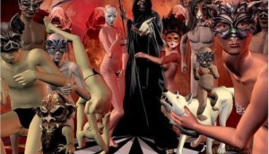
Iron Maiden - Dance of Death
What does an Eyes Wide Shut orgy with animal masks need, more than a Grim Reaper? (I know it's Eddie, shhhh) Perhaps a child, unconvincingly riding a dog. Many of this cover's problems come from it being a prototype design which the band decided to use after the designer pulled out. You can see why. Looking closely you can see that one character has a dislocated neck, the dog is standing on the snake, the people are all out of position, limbs entwined in impossible ways, among myriad other faults. Heavy metal is known for its ridiculous cover designs, but this was just a bit shit.
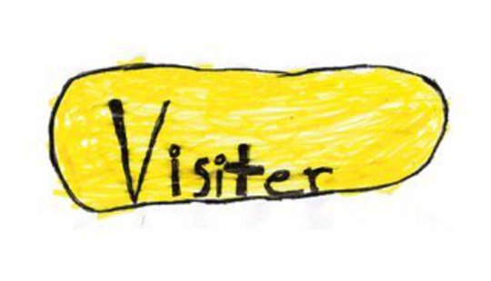
The Dodos - Visiter
Maintaining the "half arsed bit of crayon work" trend of indie albums in the 2000's, Visiter is made all the worse by the Dodos logo that seems to have been taken from a mid-80s Peter Saville cover. It looks like the record company rung the band up a few minutes before the album was due in the shops and said: "Alright guys? We've made a slight boob... No, no, it's not been pulled. Well, we forgot to sort the artwork... I know, I know. This hasn't happened before, as far as I know. No, it's not Dave's fault. Why do you always want to blame Dave? Do you think you can sort something out? I need it in 10 minutes..."
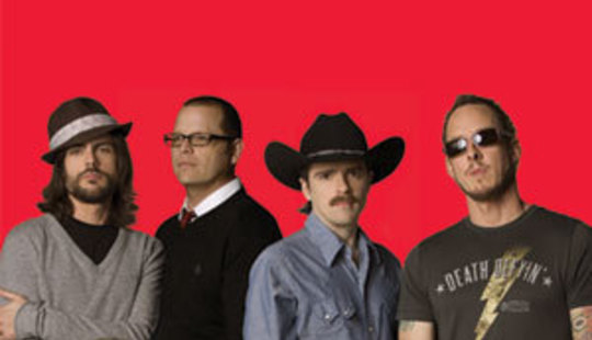
Weezer - The Red Album
There are many things that upset me about this cover (the laziness, each band member clearly being photographed separately and photoshopped together, the way they look like they come from four different bands), but the main one is that cowboy hat.
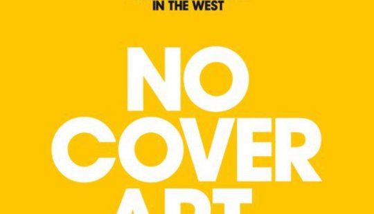
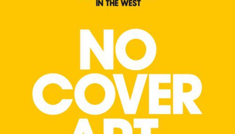
Hard Fi - Once Upon a Time in the West
Not to kick a band when they're down, what with all the opprobrium this cover attracted first time round, but really? When your music isn't that good, perhaps you might want to package it more attractively... Instead, they did this. Mustard yellow, aggressive white and black font. It's not appealing, and it's not even an original concept (see here). Let's not even go into the fact that if there really was no cover art, we would be staring at the CD through a transparent plastic cover. It is idiocy masquerading as profundity. Every time I stare at it, I feel like the void is staring back at me; I feel the futility of my existence; I can feel the sands passing through the egg timer of my life. And I sigh.

Brooke Hogan - The Redemption
Last seen adorning a mural on the side of an 18-wheeler truck, daughter-of-Hulk Brooke Hogan released this last year. That bikini made of shimmers, wisps and glitter is divine.

Creed - Weathered
It's classical album cover design, a weathered effect (like the album's name, DO YOU SEE?) on a design that could have come from the 1970s. Why are Creed being carved into a tree? Why is a woodcarver who can make such photorealistic designs wasting his time on carving staid nu metal bands into a trees? Why is he doing this carving when the sun appears to be going supernova? All these mysteries make this one of the album covers of the decade.

The Coup - Party Music
This is more bad taste than bad design. Or prophetic, made as it was three months before 9/11. Strangely, its early September 2001 release was pulled, and the album was released a couple of months later with new (boring)artwork. Never forget...

The Handsome Beasts - '04
No.
"We need a nun. In suspenders. Smoking."
"And a pig."
"And an ugly man"
"That's totally fucking rad."
Sadly, judging by the band this cover is all too serious.
Those are my worst album covers of the noughties (or whatever you call the previous decade), but what are yours? I am genuinely interested (sort of). So... vent, my children, vent.


